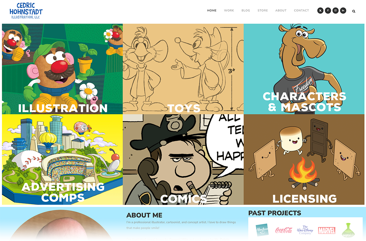
21 Nov NEW Website!
I've given my studio website a complete overhaul and stuffed it with artwork showcasing my years of experience in the illustration biz. Have a look around. ...
I've given my studio website a complete overhaul and stuffed it with artwork showcasing my years of experience in the illustration biz. Have a look around. ...
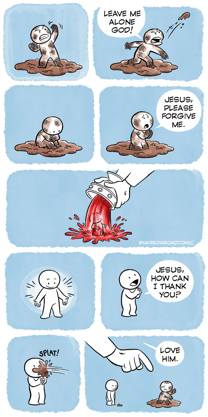
In between client projects I sometimes draw a Christian webcomic called Narrow Road Comics. This recent comic seemed to connect with a lot people, getting over 1,400 shares and 260,000 views on X (Twitter). Wow. ...
Paul Cox is a Christian cartoonist and illustrator. You may know him from his webcomic RefToons. Recently he interviewed me about my Christian webcomic Narrow Road Comics. We talked about being a Christian in today's illustration market, making religious webcomics, my artistic influences, and advice for illustrators starting out today. https://www.youtube.com/watch?v=xLCwWXMXM8w ...
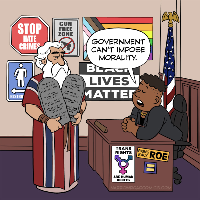
In between client projects I do a Christian webcomic called Narrow Road Comics.. Recently I got a little political, and my comic blew up on X with millions of views. Louisiana recently passed a law requiring the Ten Commandments to be posted in public school classrooms. I drew this comic expressing my take on the matter. My post on X got over...

https://www.youtube.com/shorts/bbj9CXIFVGQ Sometimes life is hard. And we don't alway understand why. I take comfort in knowing that Almighty God is somehow weaving a giant tapestry far beyond my puny ability to comprehend. In between client projects I do a Christian webcomic called Narrow Road Comics. When I got the Idea for this comic, I thought it would work best as a...
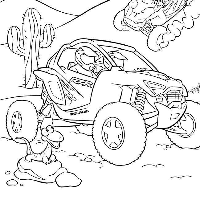
Last year the Six Speed marketing agency in Minneapolis hired me to illustrate a children's activity book to promote Polaris snowmobiles. This summer they hired me again to do one promoting their ATV's. Here's a few of the finished pages: ...