02 Sep How MAD Magazine Used Photo Reference
MAD was a long-running magazine that used cartooning and humor to make fun of American culture. The cartoonists at MAD were some of the best in the business. In my opinion much of their work still holds up as very strong even today.
Every issue included a comic strip parody of a blockbuster movie. If a movie was a hit MAD tried to work quickly to make a parody while it was still in theaters. A big challenge for the artists was finding visual reference to accurately draw from. In the days before the internet (or even VCR’s) you couldn’t just download a trailer or freeze-frame a clip from the movie. Instead, movie studios would release a few dozen publicity stills and promotional photos, and that was it. Such publicity material was often the only visual resource a MAD artist had to work from when trying to accurately retell a movie in comic strip form.
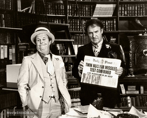
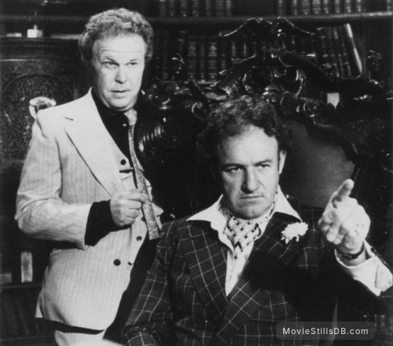
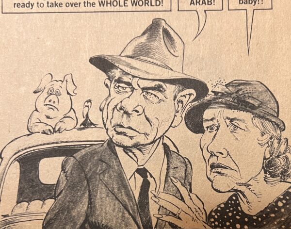
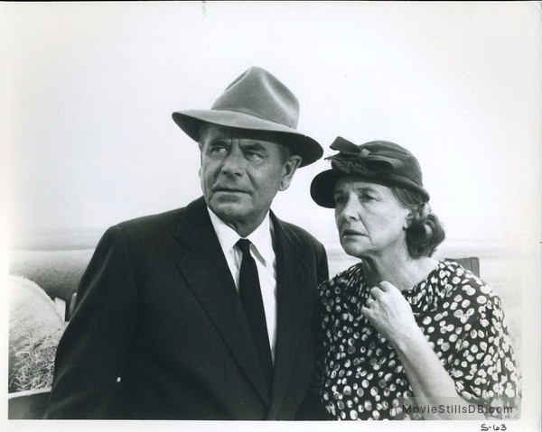
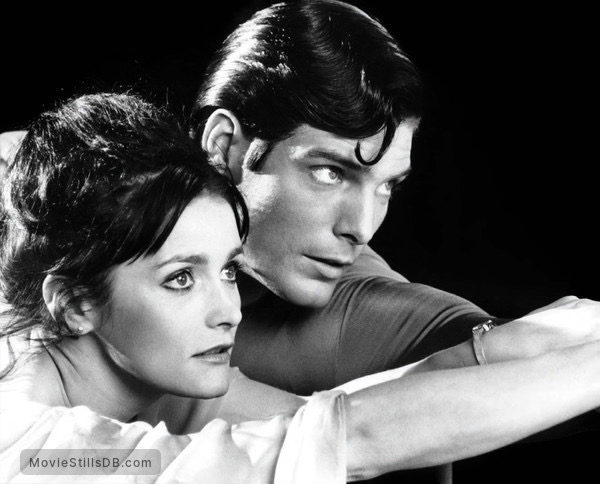
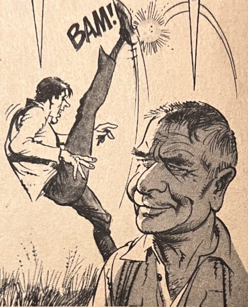
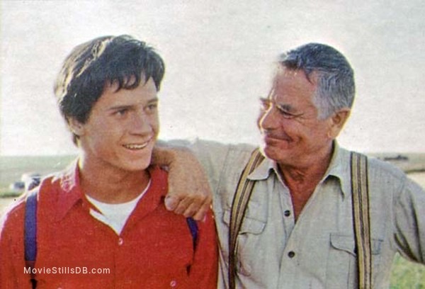
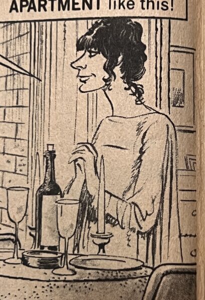
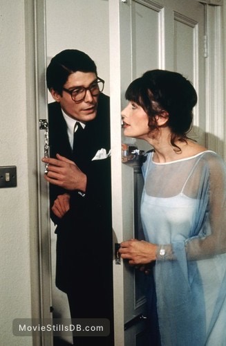
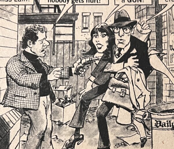
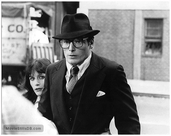
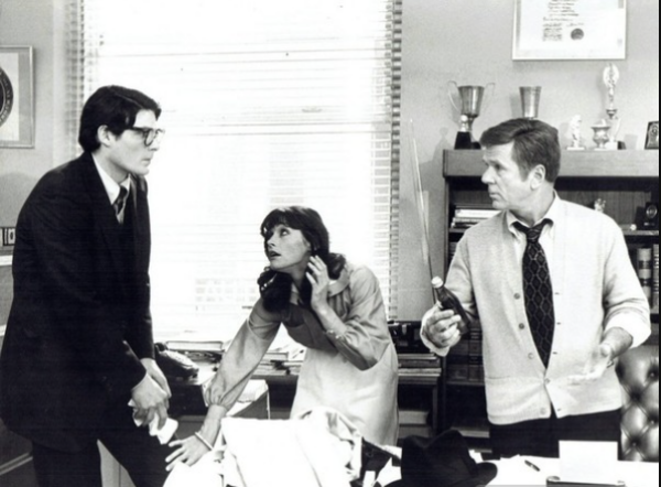
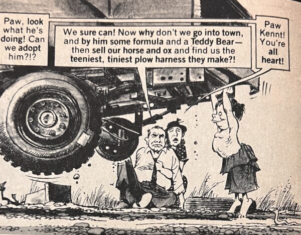
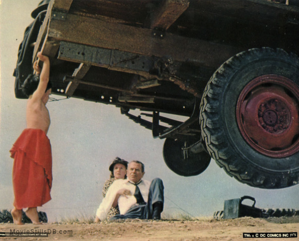
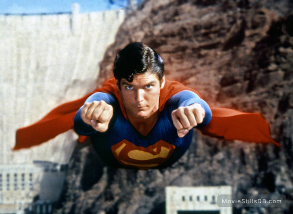
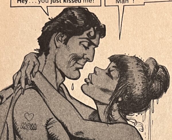
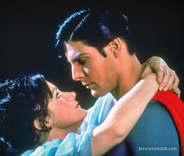
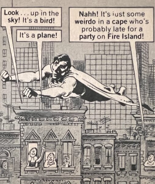
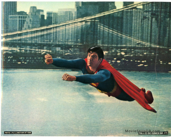
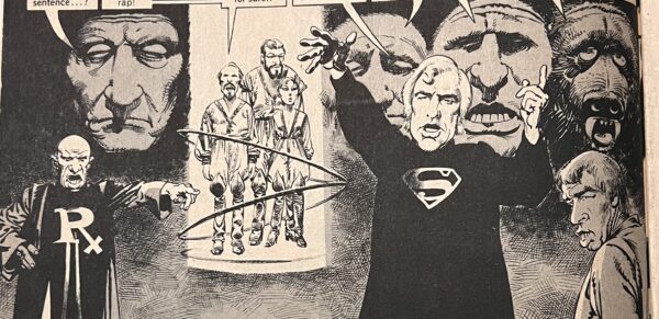
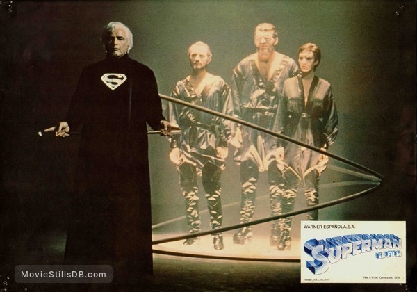
My absolute favorite movie growing up was SUPERMAN (1978). I must’ve watched it a million times and knew every scene by heart. Recently I purchased a copy of MAD magazine from 1978 (issue #208) with a parody of the movie drawn by the great Mort Drucker. I then found a Pinterest board featuring some vintage publicity stills from the movie and compared them with Drucker’s amazing drawings, which I snapped with my iPhone. It’s fascinating to see how he translated the photo reference into comic form, to look at where he used reference material and where he had to just make things up. One of the reasons Drucker is considered a master is that whether he was cribbing off of photo reference or inventing things on the fly, it all fits together seamlessly.
There is nothing wrong with using photo reference in your artwork. The challenge is to not use it as a crutch but instead to put your own spin on it. Instead of just copying what you see you should use the reference as a springboard for something organic and appealing and unique to you. Drucker mastered that skill. He used the photos to get the likeness correct and to approximate the costume and sets, but he wasn’t a slave to the reference. He had a strong enough grasp of anatomy, acting, and humor that he could improvise and add more life and energy to a pose whenever it was needed. He also loved to fill up dead spaces in the frame with tiny throw-away gags. They keep the compositions more visually interesting and help make everything feel more fun.
This is not an exhaustive list of examples but it gets the idea across. Enjoy!

