03 Nov Cow Mascot for Mountainside Farms
Earlier this year I was contacted by Mountainside Farms, a regional east coast dairy company, to help them design a new mascot for their packaging. They had been using a cow character designed by another illustrator but decided it was time for a new look. They asked me to design a cow who’s face could be plugged into the existing packaging layout.

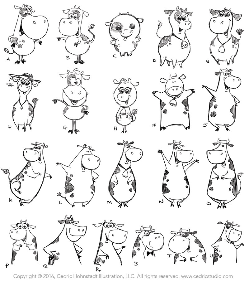
I started by doing a bunch of rough sketches experimenting with various shapes and poses. Some were stronger than others but that’s part of the process.
I knew that the general public would likely only see the cow’s face but it felt more natural to design the full body. If, in the future, the client ever decided they wanted to use a full body pose for anything I didn’t want to be put in the situation of having to Frankenstein a new body onto the head. I think you get a stronger and more pleasing result when the body and head are designed together.

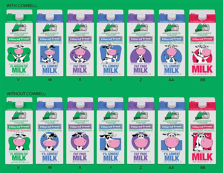
I also tried Photoshopping various heads onto the existing packaging. I also experimented with variations on different background shapes, cowbell or no cowbell, etc.
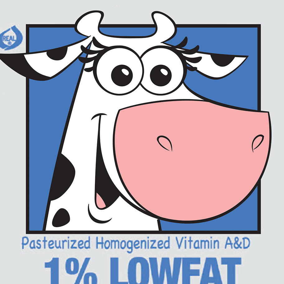
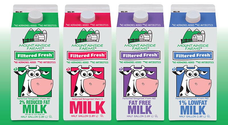
After some back and forth with a few refinements, here’s how the final design turned out:

Looking for a mascot for your brand or business? I can help! Read about The Power of a Mascot or fill out this questionnaire to help me understand your needs.


