28 Mar Renaissance Game
Posted at 08:01h
in Illustration
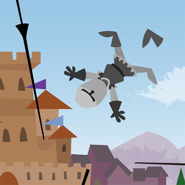
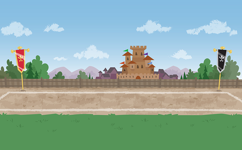
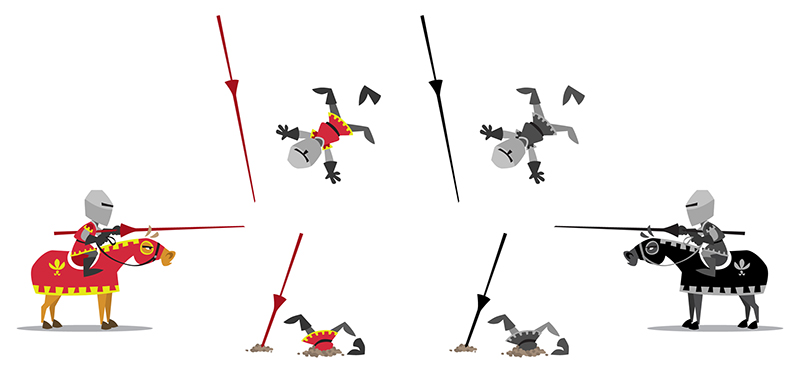
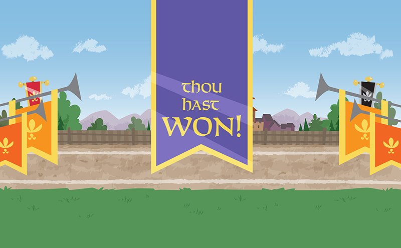
Recently I was hired by the Minneapolis Star-Tribune to help them pitch an idea for an interactive ad that included a simple animated Renaissance game. Here’s the concept art I worked up. The game needed to fit two different aspect ratios, so which is why there is so much empty space along the top and bottom:


