Style Exploration for Disney Figurines

A toy licensing company asked me to help them explore ideas for a line of Disney figurines. They wanted the characters to be recognizable but at the same time stylistically unique, almost as if the characters all belonged in the same world. It sounded like a fun challenge.

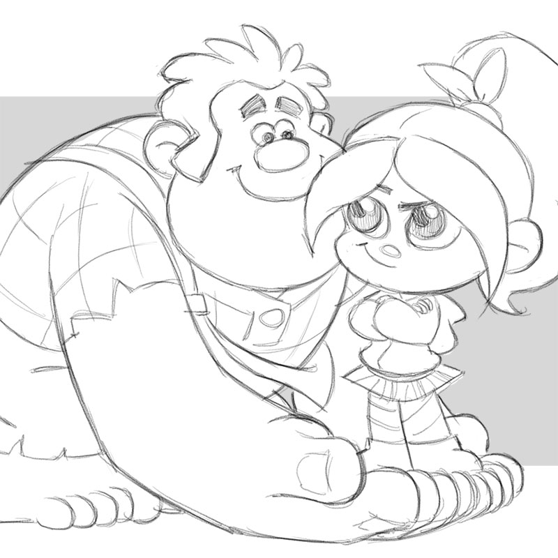
I started by noodling around just to see what might work and what wouldn’t. First I tried to see what I could/couldn’t do with Mickey Mouse, followed by Ralph and Vanellope from Wreck-It-Ralph:

After some client feedback we eventually settled on a “look”. Next I began exploring possible poses for the figurines. They asked that the characters appear to interact with each other visually, but with poses that would also work as stand-alone figurines:

Eventually I worked up sketches and turnarounds for twelve characters. I can’t show them all but here’s what we wound up doing with Dash and Violet from The Incredibles:

Unfortunately the plug was pulled before the project could make it across the finish line. But it was fun while it lasted. (Images are posted with client permission.)

Hulk and the Agents of S.M.A.S.H.

One of my clients is DecoPac, Inc., a novelty toy company that makes many of the cake toppers you see in bakeries and grocery stores. Most of their products are tied to licensed merchandise, and sometimes I get the fun of helping them develop a toy idea for a popular character. The challenge is to come up with something creative and fun for kids to play with, but that can also be produced inexpensively (often with no moving parts) and fit within the 3″ clearance space of a plastic birthday cake box.

Last year they asked me to help out with a toy for a new animated series from Disney/Marvel called “Hulk and the Agents of S.M.A.S.H.” We worked up a couple of ideas. Now that the toy is in stores I can publish the final design, but the client has requested that I keep the other sketches under wraps.

Hulk Smash!

Hulk Smash!

Hulk Smash!

Here’s how the final toy turned out:

17896_35323

17896_35323inset


Pit Stop Toy Design for Toys-R-Us

Last fall I was hired by Toys-R-Us to develop some rough concept sketches for a  race track playset they were working on. The idea was to decorate the track with interactive elements including a grandstand, pit stop, oil spill, and orange cones. These are some of the rough sketches I worked up based on the ideas they described. Ultimately the project went in another direction, but Toys-R-Us has given me permission to post the work I did.

(Click images to enlarge.)

Race Track Toy Design from Cedric Hohnstadt Illustration

Race Track Toy Design from Cedric Hohnstadt IllustrationPit Stop Toy Design from Cedric Hohnstadt IllustrationPit Stop Toy Design from Cedric Hohnstadt IllustrationRace Track Toy Design from Cedric Hohnstadt Illustration

“Cut The Rope” Toy Design

Cut The Rope sketch

A few months ago I was hired by DecoPac, Inc. to design a “Cut The Rope” toy for their novelty cakes. Here’s how the final product turned out. Look for it at your local bakery this Spring. Nom! Nom!

Cut The Rope cake

Cut The Rope toy


Sketchbook Month: Day 8

Today’s doodle is based on a casual comment I tossed off to my wife about one of our girls’ toys. It made her laugh, so I thought I’d translate it into my sketchbook.

Don’t forget to check out all the terrific art that continues to flood into the Sketchbook Month blog. Great job everyone. Keep ’em coming!

Toy Design: Minnie Mouse Picture Frame

Last year I was hired by one of my regular clients, DecoPac Inc., to help with a Minnie Mouse toy concept for Disney. It takes a long time for a toy to do from original concept to final product so I’m just now able to reveal it.

The client showed me some misc. graphics provided by Disney including some “Dress Shop” clip art and a black silhouette of Minne Mouse walking a poodle and carrying a purse. The idea was to combine them into a pair of toys with a “shopping” theme: a curved picture frame with removable paper insert , and a matching figurine of Minnie based on the pose in the silhouette.

Because of the practical realities of the toy business sometimes something beautifully drawn in 2D may not perfectly translate into a child-friendly 3D sculpt. That was the case with the original Minnie silhouette (not shown). In it Minnie’s purse was hanging loosely off of her wrist which was a safety concern. If we sculpted the toy that way the purse could snap off and become a choking hazard. So I tweaked it to have her gripping it firmly in her hand instead. Likewise we changed the dog leash to a shopping bag but again it couldn’t have strap handles, it had to be gripped firmly in her hand.

Even Minnie’s arms had to be brought in tight to her sides to prevent them from snapping off. However, I didn’t want to also bring her arms in on the silhouette because it would lose a lot of clarity. Her torso and arms would morph into one ambiguous black blob. As a result the final figurine doesn’t perfectly match the silhouette, but hopefully it was close enough that the two pieces still felt like part of a set.

Here’s What I came up with:

Here’s how the final toy came out: