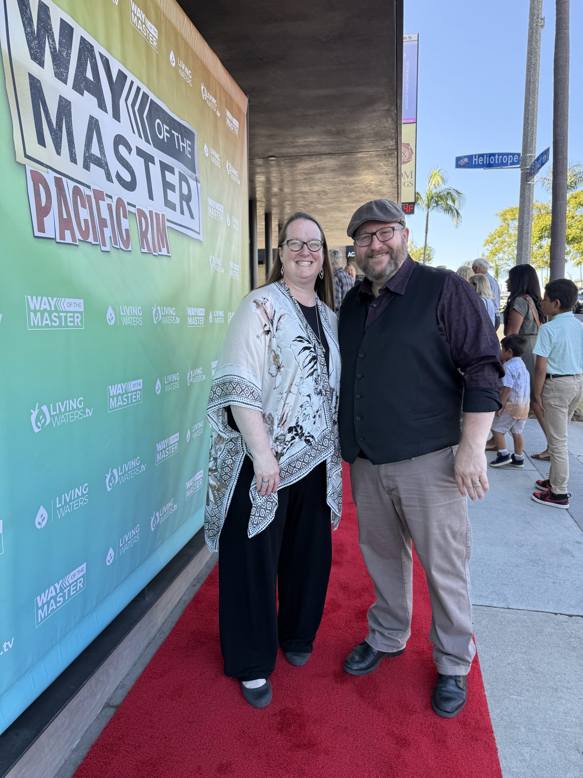
Mini-Comic for Red Bag Ministry

Red Bag Ministry is a Christian ministry based in Pennsylvania. Every year on Christmas Eve teams of volunteers go door to door giving out thousands of red bags containing free food, inspirational gifts, and a Bible. Their goal is to share the love of God and point people to Jesus, no strings attached. They hired me to create a short mini-comic to include in this year’s bags. They gave me a few parameters (for example, they wanted it to start and end with volunteers at someone’s door) and I worked with that.

Read the whole thing here:

You can learn more about Red Bag Ministry on their website.

Classic Comic Book Cover Study

When I was young I would often redraw an image from comic books. I could learn a lot from copying what other artists had done. Why did they draw this muscle this way? Why did they put this line here? Why did they include this detail but not that one? Why this pose? Studying a professional artist’s work is a really great way to improve.

I haven’t done that in years, so for my latest sketchbook session I thought I’d give it a try. My dad collects old cowboy western comic books from his childhood. Some of them have some really great covers! So I googled “cowboy comic book” and chose a cover that I liked. Now that I’m a professional illustrator myself I didn’t want to just copy it line for line. Instead I thought I’d try sketching it in something closer to my own style.

I still learned a lot.

Here’s the original. Unfortunately the artist isn’t credited:

Generations Phonics Book Cover

Generations is a Christian organization focused on ”biblical family, discipleship, and education”. They hired me to illustrate a cover for a phonics textbook they were publishing. They had some existing mouse characters (a boy and a girl mouse) and wanted me to illustrate them in a family scene with the word balloon, ”Teach me to read God’s word”. It was my job to design a mom, dad, and baby that matched the existing characters.

Below is a peek into my process: Rough sketch, detailed sketch, and final illustration.

The curriculum is available here.

Polaris Activity Book

When people want to buy a snowmobile, whether it’s at a retail showroom or an event, they sometimes bring their kids along with them. Polaris decided to create an activity/coloring book for kids that they could give out to their littlest customers. They hired Six Speed marketing to create the book, and Six Speed in turn hired me to illustrate it.

Here’s a couple of the finished pages:

Deer for Spypoint FLEX

Spypoint is a Canadian company that makes trail cameras for deer hunters. To help promote their FLEX camera they hired me to illustrate a tough-looking cartoon dear in a muscular flexing pose. They’ve given me permission to show the work I did for them.

I started with some rough thumbnails exploring possible poses:

Based on their feedback I worked up a tight detailed sketch with rough color:

Here’s the final design:

I don’t think the art has made it out into the real world yet but the client has given me permission to share. Once they release the finished design with text I’ll post it here.

How MAD Magazine Used Photo Reference

MAD was a long-running magazine that used cartooning and humor to make fun of American culture. The cartoonists at MAD were some of the best in the business. In my opinion much of their work still holds up as very strong even today.

Every issue included a comic strip parody of a blockbuster movie. If a movie was a hit MAD tried to work quickly to make a parody while it was still in theaters. A big challenge for the artists was finding visual reference to accurately draw from. In the days before the internet (or even VCR’s) you couldn’t just download a trailer or freeze-frame a clip from the movie. Instead, movie studios would release a few dozen publicity stills and promotional photos, and that was it. Such publicity material was often the only visual resource a MAD artist had to work from when trying to accurately retell a movie in comic strip form.

My absolute favorite movie growing up was SUPERMAN (1978). I must’ve watched it a million times and knew every scene by heart. Recently I purchased a copy of MAD magazine from 1978 (issue #208) with a parody of the movie drawn by the great Mort Drucker. I then found a Pinterest board featuring some vintage publicity stills from the movie and compared them with Drucker’s amazing drawings, which I snapped with my iPhone. It’s fascinating to see how he translated the photo reference into comic form, to look at where he used reference material and where he had to just make things up. One of the reasons Drucker is considered a master is that whether he was cribbing off of photo reference or inventing things on the fly, it all fits together seamlessly.

There is nothing wrong with using photo reference in your artwork. The challenge is to not use it as a crutch but instead to put your own spin on it. Instead of just copying what you see you should use the reference as a springboard for something organic and appealing and unique to you. Drucker mastered that skill. He used the photos to get the likeness correct and to approximate the costume and sets, but he wasn’t a slave to the reference. He had a strong enough grasp of anatomy, acting, and humor that he could improvise and add more life and energy to a pose whenever it was needed. He also loved to fill up dead spaces in the frame with tiny throw-away gags. They keep the compositions more visually interesting and help make everything feel more fun.

This is not an exhaustive list of examples but it gets the idea across. Enjoy!

Here Drucker combined two promotional stills, taking Otis from one and Luther in his fancy chair from another.
As he often did, Drucker adds something silly (in this case cartoon animals) to help fill up the frame.
Drucker was a skilled enough cartoonist that he could totally invent a cartoony pose of young Clark Kent kicking a football in the background, and yet it still have it feel like it matches the more grounded drawing of Pa Kent (Glenn Ford) in the foreground.
Drucker removes Lois and fills in what would have been just a blank window with a more active background, including a gag drawing of Batman on the TV in the upper right corner.
Not sure why this image was flipped but the snake in the lower right corner and the patches added to the tires are nice touches.
In these scene Superman has to leap into the air and fly to the camera for the first time. Drucker may not have had that exact shot to work from so he takes a different shot of Superman flying towards us and adds some dangly legs to make it feel like he is leaping off the ground.
Another flipped image. In this case it was probably flipped because Superman’s dialogue comes first. Putting him on the left allows his words to be above his head. Notice Drucker even adjusted the part in his hair. Instead of being a slave to the reference, he modifies his drawing to match Superman’s new position.
The shading on Superman’s face is kinda funky here but the actual image is very small on the page so you barely notice. Also, Drucker adds buildings to the background and makes them ornate to help them stand out from the bland skyscraper “grid” patterns.